2019 Armory Week Recap
Normally in March I’d write a massive blog post recapping all of the art fairs that I went to, highlighting pieces I was amazed, delighted, and inspired by. Traditionally it’s been a long, labor-intensive article where I share my top picks from each fair and explain what it was that drew me to each piece.
This year I couldn’t stomach giving up a week’s worth of creating time so I put myself on an art fair diet and chose to not go to the Armory at all and instead chose to only go to two fairs: Art on Paper and Spring/Break. I enjoyed both and found multiple artists that satisfied my craving to see great art. I thought I’d share a few here with you.
By no means is this a comprehensive list of what I thought was worthy of mention. Think of this as the highlights of the highlights – a lite version of my usual Armory Week review. Enjoy!
Art on Paper
Drew Leshko’s work, presented by Paradigm Gallery, instantly captivated me. Intricate scale models of iconic New York subject matter (neon signs, water towers, decrepit warehouses) skillfully created using paper, pigment, and everyday ephemera such as paint cans and coffee stir sticks. I found this work particularly enticing because I’ve been creating several scale models of objects for dioramas that will house the characters from the One of Us series. I can truly appreciate the effort and patience it takes to create work on this miniature scale.


Jonathan Ferrara Gallery presented self taught assemblage artist Kat Flyn’s work, which stopped me in my tracks. She constructs narrative scenes that speak to the state of American society. I was especially enamored by her two-sided piece, Foreclosure (2017), which contrasts a picture perfect white folks’ house with the somber reality of an African American home.

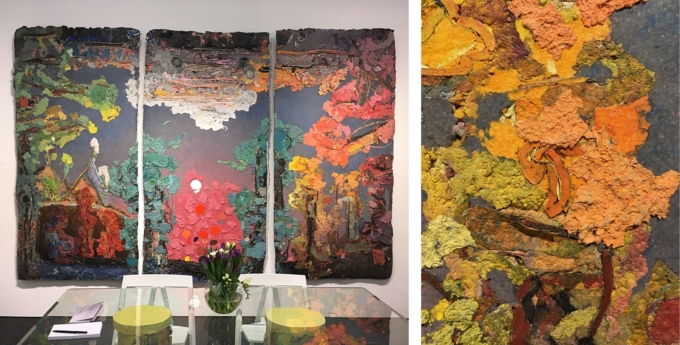
You don’t often get to see paper pulp pieces on a grand scale, but Roland Poska of Jerald Melberg Gallery delivered. Several grand, pillar-sized sculptures dominated the central promenade of the event space with impressively sized 2-D works being shown inside the gallery’s booth.

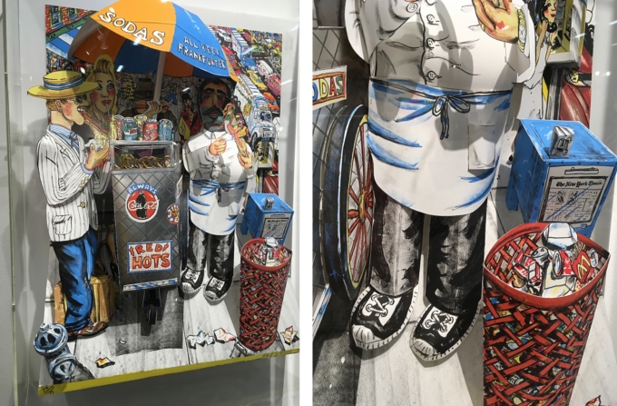
Seeing a playful, Red Grooms’ 3-D lithograph and linocut on paper (Hot Dog Vendor, 1994) that had been manipulated into a relief configuration brought me great joy. Delightful to see the dimension and depth that a few simple slices, folds, and overlaps can bring to a piece.
Spring/Break
While Art on Paper redeemed itself from last year’s showing, Spring/Break was very satisfying, indeed. This year I made a point of going early enough so that I would be able to see more than just a portion of the booths.
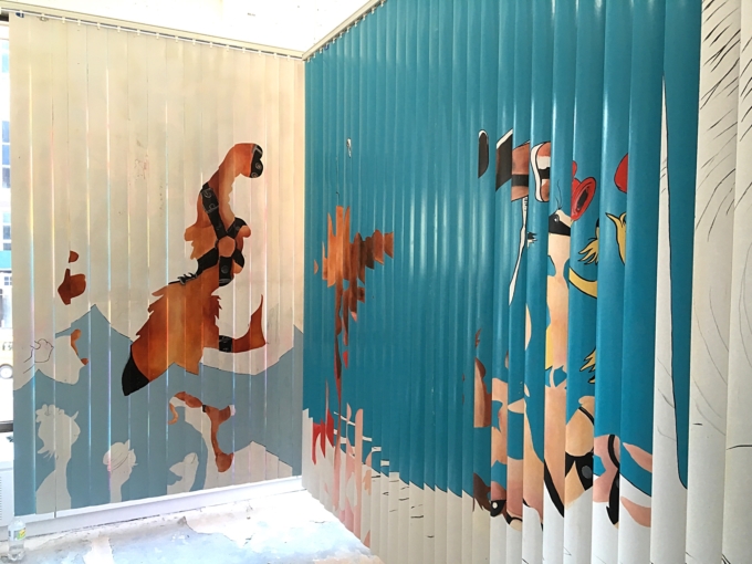
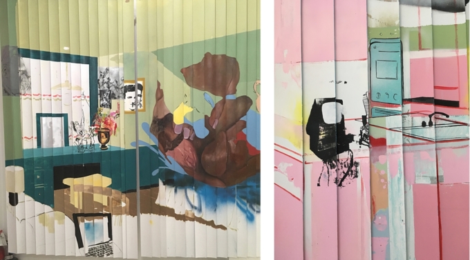
Sam Bennett’s Veiled Pleasures (curated by Jordan Segal), stunning large-scale, mixed media works on vertical blinds, popped up at various locations throughout the space. These gorgeous 2-sided pieces were hung to have both sides on view and, able to be manipulated by the viewer, allowed endless visual variations.
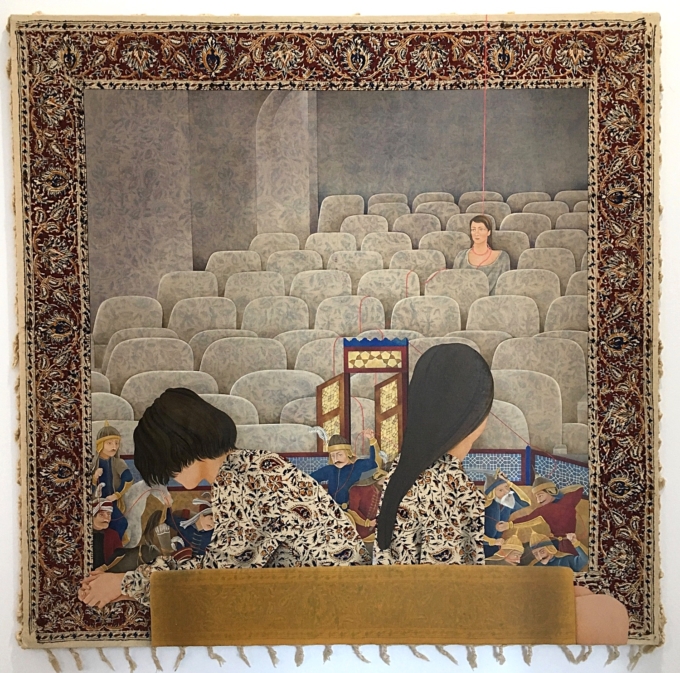
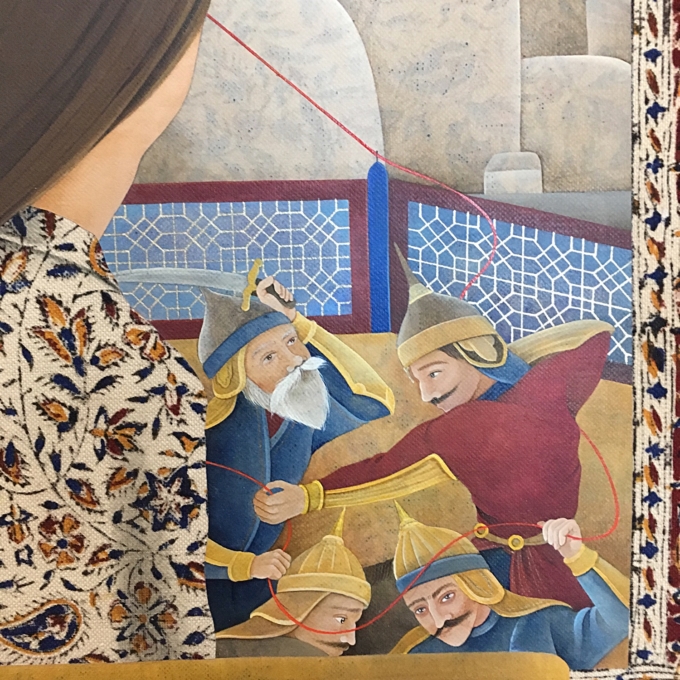
Arghavan Khosravi’s Without Within (curated by Kristen Smoragiewicz) presented everything I want in a piece: concept and practice wrapped in narrative and delivered with pure skill. Using tasseled, printed scarves and found textiles as a base for her paintings, Khosravi cleverly leaves the patterned textile untouched in places, and thinly paints over in other areas, using the printed ground to give texture and depth to her compositions.
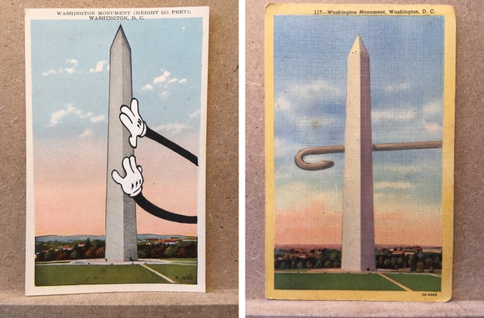
David Opdyke, represented in the Auxiliary Projects booth, got top marks for dark humor and skillful execution. His altered vintage postcard series, several of which are versions of the Washington Monument, both made me laugh and broke my heart. And I do appreciate an artist that makes the effort to give good title.

That’s it – short and sweet and to the point. Maybe you found an artist or artwork in this collection that delighted and inspired you, too?
I hope you can carve out some time to explore the links I included for each artist. Each one of them is truly worth investing time for a deeper exploration.