Armory Week Debrief
I have a pathological hatred for winter but I always look forward to the first weekend in March – Armory Week.
While the goal of the galleries might be to sell as much work as possible, the fairs are a useful resource for artists. The shows are an efficient way to information gather on pricing, display tactics, and the subtle sussing out of potential galleries that one might want to approach later regarding representation.
The fairs are also useful for pure inspiration’s sake.
In the past I’ve separated my Armory Week art fair adventures into multiple Facebook posts (according to venue) and posted a curated mini-tour of each fair I attended.
This year I’ve decided to share my findings in a slightly different way – a single blog post where I’ve distilled my favorites from all five art fairs and delve deeper into my attraction and connection to the work.
I was very judicious with the use my camera. I didn’t pull it out unless an artist gave me considerable pause. From the 75 images I took over 5 days in 5 venues I’ve chosen a precious handful of artists to share with you.
All of the art I’m featuring here is new to me. I’m thrilled to have been introduced to these exiting artists and their work. I hope that you enjoy them, too.
The Armory Show, as always, was massive and overwhelming and Aida Makoto’s epic mural piece, Jumble of 100 Flowers was right at home in the venue. The length of time it took the artist to complete the work (2012-2017) is worthy of kudos in and of itself (high five for being committed!), and the subject matter tickled my fancy, too.

Aida Makoto, Jumble of 100 Flowers (detail), acrylic on canvas, 200cm x 1750cm, 2012-2017.
Imagine a piece 6 feet, 6 inches by 58 feet chock full of cavorting naked ladies, exploding open and oozing miniature flowers, fruit, candy and feathers. Colorful and whimsical at first glance a further inspection starts to reveal macabre details, such as the hairline sights focused on the figures. Suddenly the facial expressions become ambiguous – are the women laughing with glee or are they caught at the moment of a scream unfolding as they are blasted open by an unseen sniper? A sniper that stands, I must point out, in the same position as the viewer. As an artist who utilizes ambiguity, I understand and appreciate the use of surface whimsy to engage a viewer in what might reveal itself as a dark narrative upon deeper investigation.
I couldn’t help but stop when I saw artist Tayeba Begum Lipi’s to-scale stroller sculpture from afar.

Tayeba Begum Lipi, The Stolen Dream (detail right), stainless steel, 70cm x 51cm x 94cm, 2013.
The stroller is created from hundreds of shiny (and I’m sure very sharp) safety razor blades. The skill of the construction is impressive. Even the wheels are sculpted from cleverly bent blades. Excellent craftsmanship aside, what makes the piece sing is the dissonance between the object’s intended use and the material from which it is fashioned. In my opinion a bit of tension (or a lot) takes an art piece up a notch. If my work starts feeling too “safe” I know it’s time to fine-tune the tension factor.
Rina Banerjee’s epically titled dream–like pieces were visually intoxicating.

Rina Banerjee, Beauty was not in the East- her figure was in part a repellent l and his aura was not so neat. The locus of a pleasure stolen from deceit, stubborn and excessive the oriental was transformed in part as objects of sexual bad habits. (details), acrylic and collage on paper, 29.75 x 44.78″, 2014.
Her exquisite use of color, mark-making, and a collection of unsettling characters morphing across the page made me so, so happy. Oh to paint like this! (I would have taken a full-size image of this amazing piece, but the location and the reflections from the lighting made it impossible to capture and do justice – view it here in it’s full glory).
Occasionally you see a work by an artist who is completely familiar to you, yet your mind is blown when you look at the title card because you never would have guessed that it came from their hand.

Salvador Dali, Anatomies (detail right), oil on cardboard affixed to plank, 50cm x 64cm, 1937.
Such was the case with this oil on board piece by Salvador Dali. The spontaneous, stamped-print quality of paint application juxtaposed with a few carefully brushed details immediately piqued my interest. And the mysterious drawer bosom? Say no more! Striking a balance between freedom and control is forefront in my mind when I’m creating. I have a long way to go before I achieve a result of this level (control always wants the upper hand). I find a piece is so much more interesting if the material application and mark-making offers variety.
Once again, the Volta fair didn’t disappoint. The appeal of this fair is that the participating galleries choose a single artist to feature in their booth. Doing so allows the viewer a proper introduction to a range of the artist’s work, process and intention – an understanding that is difficult to achieve in situations where you only get to view one or two artworks by several artists.
Gallery MoMo of Tokyo delighted me with the paintings of artist Naomi Okubo. Her densely patterned and intricately detailed paintings feature multiple exposures of herself.
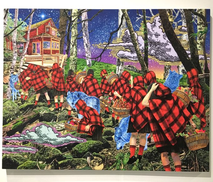
Naomi Okubo, The Girls are Walking to the House with the Wolves, acrylic on cotton, 91cm x 117cm, 2015.
The icing on the cake for me was seeing that the artist was present, wearing the same intensely-hued outfit, down to the last detail, featured in one of her larger paintings. I love when life-imitates-art-imitates-life and morphs into the meta, so I was equally tickled to see the “Red Riding Hood” painting depicted on the back wall in the piece below.

Naomi Okubo, artist with This Is Not My Life #1, acrylic on cotton, 97cm x 130cm, 2016.
I fell in love with Tel Aviv artist Batia Shani, represented by Tamar Dresdner Gallery.

Batia Shani, (l-r) Untitled Dress, detail of installation view, Untitled Dress, mixed media, approx. size 30cm x 25cm each, 2016.
I felt such a connection to the way she worked, from her collage-like methods of construction, her exposed subject matter, and the fact that she recycles personal affects and incorporates the materials into her pieces (i.e. her deceased mother’s wardrobe and her husband and son’s army uniforms).

Batia Shani, Self Portrait, mixed media, approx. 60cm x 40cm, 2016.
I am a bit heartbroken that I didn’t splurge to purchase one of her pieces – it wasn’t overpriced, just out of my budget. I am still thinking of her gorgeous work and will continually strive to be as open and vulnerable with the artwork I create as she is with hers.
One gallery that impressed at ADAA’s The Art Show was Julie Saul Gallery (New York). Their presentation of Pavel Pepperstein’s recent ink and watercolour works (2016) really stood out against other gallerist’s displays of work created in the 60s, 70s and 80s. The artwork’s bright whimsy, use of text and quirky detail coaxed me in for a closer look, where I was delighted to discover dark undertones (sounds familiar, no?).

Pavel Pepperstein, Lee Harvey Oswald, watercolour and ink on paper, approx. 19″ x 25″, 2016.
Pepperstein, also a writer (among other things), crafted a narrative behind the work: this collection of drawings were discovered in Minsk in a home previously lived in by Lee Harvey Oswald. The series, titled The Secret Drawings of Jacqueline Kennedy, implying her artistic involvement. This ruse is corroborated by the statement “drawing by Jackie O.” that appears written on several of the works.

Pavel Pepperstein, Lee Harvey Oswald (detail), watercolour and ink on paper, approx. 19″ x 25″, 2016.
A lover of text in artwork, I do adore a clever supporting mythology as a side dish to the main art course.
My last fair of the season, The Spring/Break Art Show, thrilled me. I almost didn’t go because I was so non-plussed with the fourth fair I had visited (sorry Art on Paper, you’ve been my top fair pick two year’s running but you fell flat for me this time around – I didn’t even take one picture).
So glad I rallied. Fresh work in a DIY environment (this year it was the old offices of Conde Naste in Times Square) truly delivered the inspiration I was hoping to find during Armory Week. Spring/Break became my all around favorite venue this season. I’ve narrowed my share for this show down to only two artists, though there were several more at this venue that inspired and delighted.
It was such a boon to see so many artists using fiber as their material of choice. One of these artists is Sophia Narrett. She uses embroidery thread to create narrative “paintings” and diminutive sculptures that leave the viewer curious and vaguely uncomfortable.

Sophia Narrett, Dance, embroidery thread, aluminum, acrylic, and fabric, approx. 5″ tall, 2017.
This wee tableau, standing approximately 5” tall, was divine in its concurrent simplicity and complexity. The ambiguous nature of the naked, prostrate figure (totally ignored by the upright couple) fascinates me. Is she is expelling some sort of evil out of her upturned ass? Or is she a fallen unicorn with a sea-green tail? It doesn’t really matter, a piece that possesses ambiguity always strikes a chord with me. Once again, it’s a quality I aim to imbue in my own work. I like to think that a piece of art isn’t truly complete until it is experienced by the viewer – the viewer “finishes” the pieced in their act of viewing. Ambiguity prompts questions, offers multiple readings, and has the potential to connect with more people than a piece that is straightforwardly direct.
My favorite commercial gallery display (Cade Tompkins Projects of Providence) highlighted the work of artist Sophiya Khwaja.
Yes, I have saved my best for last 😉

Sophiya Khwaja, Dissected, mixed media collage, 16″ diameter, 2014.
Khwaja’s work was what I had been aching to see. Something so beautifully crafted, conceptualized and constructed, multi-layered and personal. Hers is the caliber of artwork that I aspire and strive to create in my own practice. And yes, the fact that she repeatedly uses her own image as characters in her narrative pieces is deeply meaningful to me.
It’s no surprise that I’m drawn to work that I feel incorporates similar elements, concepts and themes that I use in my own practice: multiples, obsessive technique, and a certain je ne sais quoi that I like to call the Level of Disturbance factor.
Although I do appreciate all fine works of creation (even works that are in no way disturbing), for a piece to make me truly excited I need to be shaken out of my comfort zone. A collector I met once-upon-a-time handed me his business card, which read, “Great art hurts”.
I couldn’t agree more.
What criteria do you measure an artwork against? What makes a piece truly inspirational for you? Please share in the comments below!