Unfair Art Fair Appraisal?
Oh, Armory Week Art Fairs (sigh).
Maybe I was particularly discerning this season. Maybe the art presented wasn’t as good as other years. Or maybe, just maybe, living in New York has turned me into an big ol’ Art Snob.
A large number of great exhibits occur in NYC on a regular basis so I know that 1) I’ve been spoiled, and 2) my expectations have been calibrated very high. As such, many of the exhibitors at this year’s March art fairs failed to excite me. Not to say there weren’t any highlights, there definitely were. The standouts that inspired, though, seemed fewer and farther between.
I like saving the best ‘til last so I’ll begin with the bitter pills 😉
Art on Paper
Art on Paper was a massive disappointment to me. This was reflected in the number of photos I took: zero. I do feel I need to add the disclaimer that I visited on opening night when it was loud and crowded and not optimal for experiencing the artwork. There were, however, other factors that took the shine off what used to be my favorite art fair. Some galleries were showing not just the same artists, but the exact same works shown in previous years. Many of the galleries went for a broad scattergun approach, cramming too many artists and/or too many works into their booth. Again, not optimal for experiencing the work. Lastly, much of the art was beautifully crafted but left me feeling empty.
The Armory
The Armory was equally as deflating, with the exception of a few bright stars that proved good craftsmanship can also be meaningful.
PSM Gallery’s Nadira Husain’s detailed and colourful works caught my eye right away. Her quirky and humorous pieces hark to her Persian and French heritage, simultaneously referencing traditional miniature paintings and contemporary pop culture. Her multi-layered process doesn’t stop at the subject matter – she uses traditional textile dying methods to lay down foundations of pattern before printing and/or painting her surreal narratives on top (Note: the colour of this work is more true in the left, full view of the piece. Darn automatic exposure).

Nadira Husain (unfortunately none of the new works presented at Armory are up on PSM’s website and their were no title cards at the fair). Approx. 24″ x 15″.
Galerie Maria Bernheim’s Ebecho Muslimova’s graphic black ink drawings depict her alter ego, FATEBE, captured at the climax of several bizarre and compromising situations meant to provoke uneasy laughter and make the viewer question the source of their unease. Technically, I love the 1940s illustrative line quality of these pieces.

Ebecho Muslimova. L: Fatebe Pedulum, ink on paper, 19″ x 16″ (approx), 2018. R: Fatebe Cowgirl, ink on paper, 19″ x 16″ (approx), 2018.
Nobuaki Takekawa’s critical and sharp kitteh propaganda posters and 2020 Tokyo Olympic commemorative ceramic statuettes (presented by Ota Fine Arts) appealed to both my aesthetic and my sense of humour. Neither of these two very new series are up on the gallery’s or artist’s personal website yet (comforting to know I’m not the only artist who’s slow to update). Here’s a wee taste of his work:

Nobuaki Takekawa, glazed ceramic, approx. 10″ tall.
Volta
I enjoyed Volta, and though there were fewer displays that excited me this year the ones that did were much appreciated.
Artist Didier William caught my eye with his large-scale, boldly patterned works – wood panels that were carved into and collaged onto with paper he prints himself.

Didier William. L: se pa Siren selman, mixed media, 60″ x 48″, 2018. R: detail.
Lush surfaces tease the eye, alternating between graphic flatness and the skillful illusion of depth. If my poor quality phone photos intrigue you visit William’s website. He has lots of gorgeous, professionally documented imagery for you to sink your cones and rods into.
Sapar, New York highlighted the work of artist Bruno Miguel, who could teach a master class in creating a cohesive environment that seamlessly narrates a singular theme across diverse media. And the fellow is PROLIFIC.
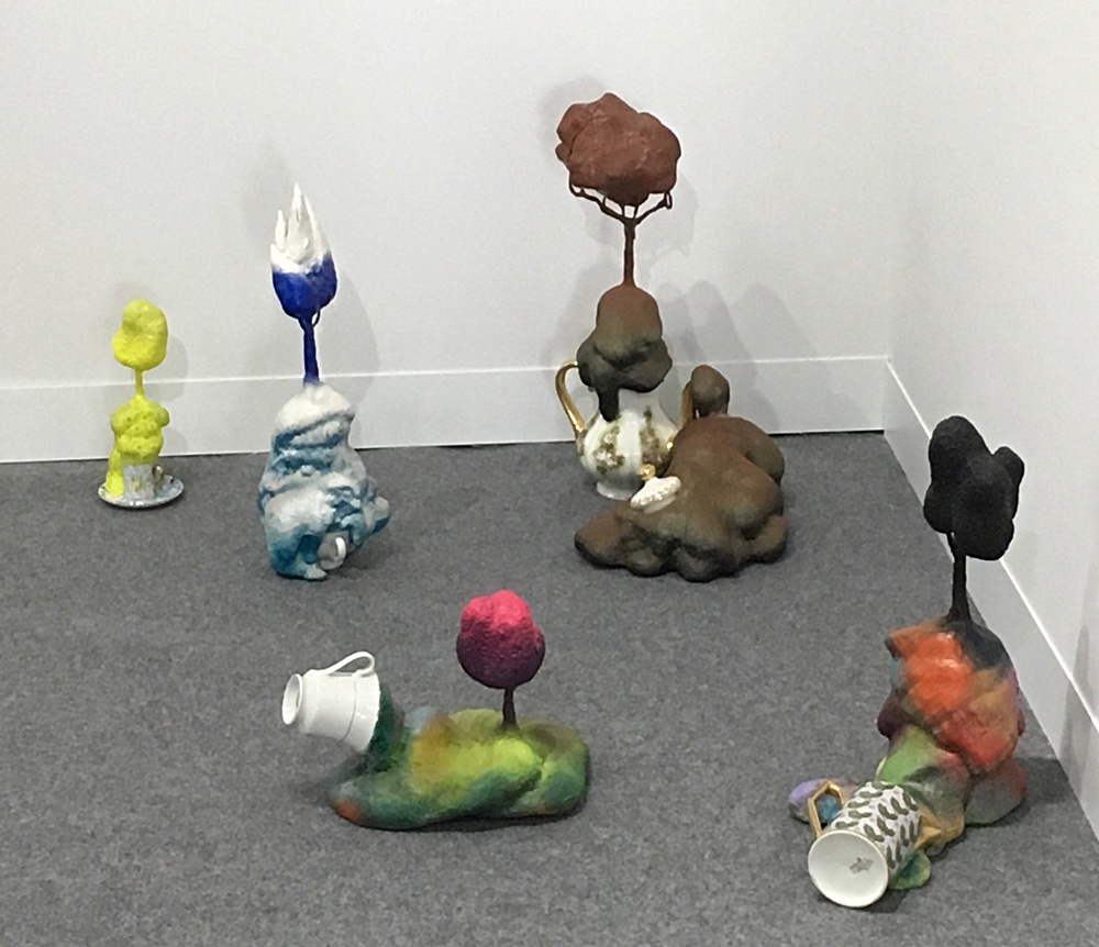
Bruno Miguel, These People in the Dining Room (detail), china, polyurethane foam, wire, paint, 2017.
To experience a more comprehensive view of his installation then my photo can provide, visit Sapar Contemporary’s page on Miguel’s recent Seduction and Reason exhibit.
I adored Erika Nordqvist’s work. Her subtle and selectively collaged and tinted drawings present subject matter that reflects her rural upbringing on a Swedish farm. The richly layered mark making in her pieces is drool-worthy. Nordqvist doesn’t erase preliminary light sketch lines but leaves them as part of the final composition and I this is what excites me most about her work – I love evidence of process. In my humble opinion, that is what makes a piece art (ironically noted that this is what I am missing in most of my pieces, ahem).

Erika Nordqvist, The Collectors, pencil on paper, 60″ x 48″, 2016.
My iPhone photos can’t do her artwork justice but there are some most excellent images of her work on the site of her representing gallery, Antonio Colombo Arte Contemporanea. Definitely worth a click.
NADA
I liked the atmosphere of the NADA fair and appreciated being able to wander through the venue at a relaxed pace, seeing everything I wanted to see in a few hours without being overwhelmed. The mixed media works and textile sculptures of Tamar Ettun (represented by Fridman Gallery) caught my eye.
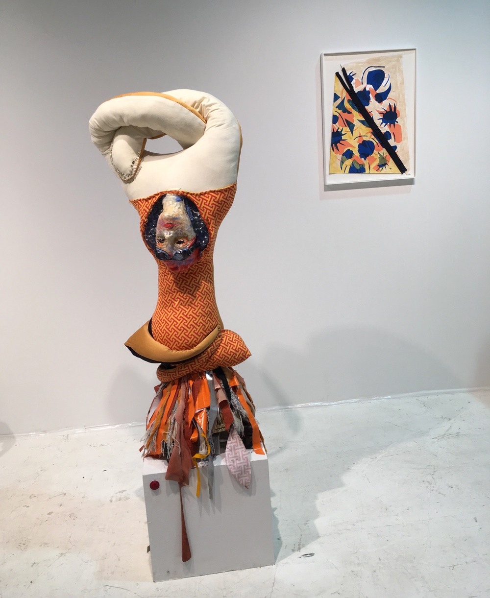
Tamar Ettun, Orange and Pink (Aimee), mixed media w/interactive sound, approx. 60″ tall, 2018.
I was thrilled to see push buttons on several of the sculptures that I was ALLOWED TO PUSH (!!). Pressing the button activated a thought provoking monologue. Note: the artwork co-ordinates oh-so-well because it is the artist’s practice to explore variations on a single color for each series she creates.
Represented by Everybody Gallery, artist Casey Jargo’s macro-mini paintings commanded my attention precisely because they were so small (scaled to the size of social media profile pictures, 1 x 1” in dimension). I do love an intimate art experience. The presenter explained that the artist modifies the smallest paintbrushes available by removing most of the bristles and only leaving a hair or two. I’m sure that this obsession with working on the smallest manageable scale possible is part of the attraction for me, but so is the dry wit and reference to popular culture.
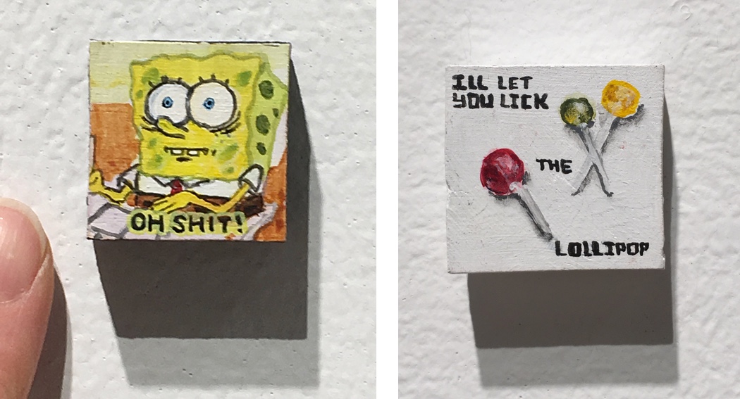
Casey Jargo, from the series, ICONS (1″ x 1″ paintings depicting web icons from the mid-2000’s used on myspace.com, 2016-18 (dates approx).
Spring|Break
Spring|Break inspired me the most – likely because, though many of the works are for sale, the focus is less commercial so the work tends to be more experimental.
One of the first installations that caught my eye were a collection of carved and painted “devices” – rather cheekily titled “Tablet” – by artist Brent Owens (curated by Ambre Kelly and Andrew Gori).

Brent Owens, Tablet, 8″ x 5″ (approx, sizes vary), carved wood, paint, 2018 – I’m making an assumption because these are not yet up on his website 😉
Beautifully crafted, I loved how he retained the natural shape of the slabs of wood in the individual units but meticulously carved the “on” button onto the bottom of most pieces.

Brent Owens, Tablet (details), 8″ x 5″ (approx), carved wood, paint, 2018.
Artist Kumasi J Barnett’s smart and sharp re-working of vintage comic book covers flip Caucasian-centric pop culture on its ass to expose stereotypes and racism. Seeing these made me very happy (he also uses a clean website template with high quality images, similar to that of Didier William, and that makes me happy, too, because it’s such a pleasure to browse through images on Barnett’s website). Curated at Spring|Break by Jac Lahav.
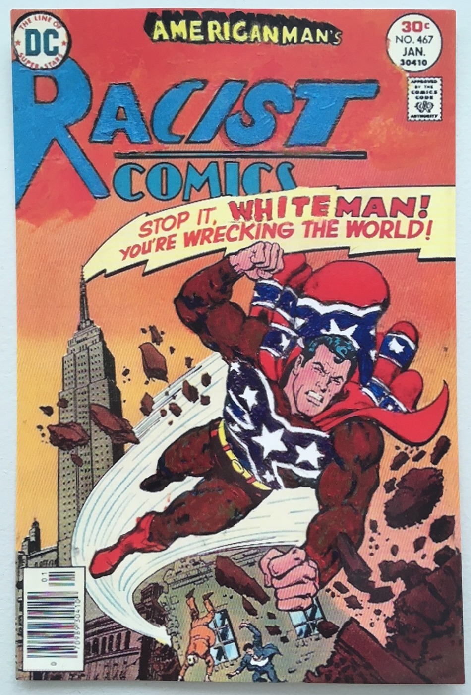
Kumasi J Barnett, Stop it White Man You’re Wrecking the World!, 9.75″ x 6.25″, comic book, paint, 2018 (?)
Self On The Shelf, curated by Christine Miele and created by artists Laia Cabrera and Isabelle Duverger (with interactivity by Nicola Carpeggiani) is an immersive, viewer interactive video installation that caught my fancy (remember how much I love to push buttons ;-)). An experience like this is difficult to convey in a still photo – the image below is the exhibit postcard and shows the setup of the physical objects in the space.

I was thrilled to find this Vimeo clip that shows the immersive video aspect of the installation. There are some dark environments that I felt connected really well with the sinister side of surveillance, which cannot be ignored in an installation where your own image is being captured and projected.
The last artist I’m going to share fascinated me. Curator Alexandra Fanning presented the fantastic performance/video works of Kawita Vatanajyankur, an artist whose videos from the series “Tools/Work” capture herself performing common domestic tasks using her body as the tools. I was so enamored by the way the video screens were set up that I didn’t think to take a photo of the installation. The arrangement was clever, with screens on the floor, bottom, and tops of walls, depending on what point of view the videos were shot. The embedded video below is shared from her Vimeo account and shows a small sampling from this series.
Venice Biennale Kawita from Kawita Vatanajyankur on Vimeo.
I find Vatanajyankur’s work to be a successful trifecta of concept, execution, and presentation. It’s spot on, strong and at the level that I continually strive to reach in my own practice.
Hmm…seems like I found quite a bit to share. Maybe I’m not such a spoiled Art Snob after all 😉
Thank you Jody for the review! Laia & Isabelle